
你有没有被传统 CSS 折磨过?
想给一个按钮加个圆角,border-radius: 9999px;想加个阴影,box-shadow: 0 4px 6px rgba(0,0,0,0.1);想加个 hover 效果,再写一套button:hover {}……一个组件写下来,CSS 文件比 HTML 还长。
Tailwind CSS 就是来解决这个问题的。它是一个 utility-first(实用优先)的 CSS 框架——不再写class="btn",而是直接在 HTML 里堆砌工具类:class="bg-blue-500 hover:bg-blue-600 text-white font-bold py-2 px-4 rounded-full shadow-lg"。
听起来很乱?但用起来是真香。
CDN 方式:无需构建,直接用
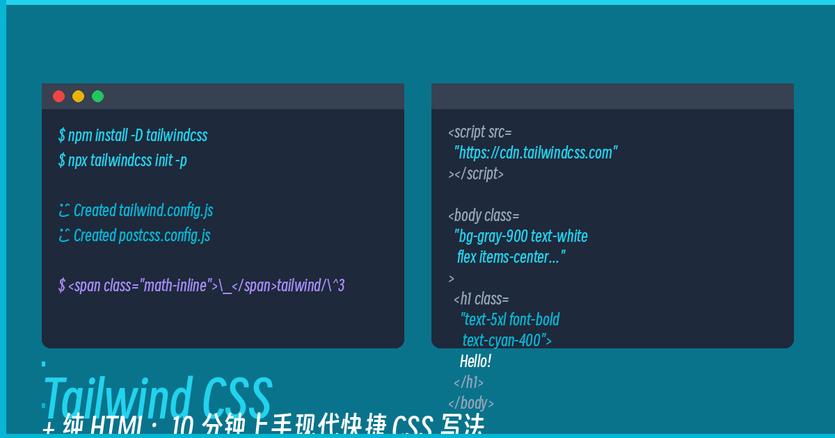
这是上手最快的方式,完全不需要 Node.js、不需要 webpack、不需要任何构建工具。一个 HTML 文件走天下:
<!DOCTYPE html>
<html lang="zh-CN">
<head>
    <meta charset="UTF-8">
    <meta name="viewport" content="width=device-width, initial-scale=1.0">
    <title>Tailwind CSS 演示</title>
    <script src="https://cdn.tailwindcss.com"></script>
</head>
<body class="bg-gray-900 text-white min-h-screen flex items-center justify-center">
    <div class="text-center">
        <h1 class="text-5xl font-bold text-cyan-400 mb-4">Hello Tailwind!</h1>
        <p class="text-gray-400 mb-8">实用优先 CSS 框架,所见即所得</p>
        <button class="bg-cyan-500 hover:bg-cyan-600 text-white font-bold py-3 px-8 rounded-full shadow-lg shadow-cyan-500/50 transition-all duration-200">
            点我试试
        </button>
    </div>
</body>
</html>保存成index.html,用浏览器打开——这就是一个完整的 Tailwind 页面。
常用工具类速查
记住这几个高频类,写页面基本够用:
文字和颜色:
– text-3xl — 文字大小,三号特大
– font-bold — 粗体
– text-red-500 — 文字颜色(red-100 到 red-900)
– text-center — 居中对齐
间距:
– p-4 — 内边距 padding 4 单位(1 单位 = 0.25rem)
– m-4 — 外边距 margin 4 单位
– mb-8 — margin-bottom 8 单位
边框和圆角:
– border — 加边框
– rounded-lg — 大圆角(0.5rem)
– rounded-full — 圆形(9999px)
阴影:
– shadow-lg — 大阴影
– shadow-cyan-500/50 — 带透明度的彩色阴影
Flexbox:
– flex — 弹性盒子
– items-center — 垂直居中
– justify-center — 水平居中
– gap-4 — 元素间距
背景:
– bg-gray-900 — 深色背景
– bg-gradient-to-r — 渐变背景
实际案例:卡片组件
用一个卡片来演示完整用法:
<div class="max-w-sm mx-auto bg-gray-800 rounded-2xl shadow-2xl overflow-hidden">
    <div class="h-48 bg-gradient-to-br from-cyan-500 to-blue-600"></div>
    <div class="p-6">
        <h2 class="text-xl font-bold text-white mb-2">卡片标题</h2>
        <p class="text-gray-400 text-sm mb-4">这是卡片的内容文字,可以用纯 HTML 配合 Tailwind 工具类实现各种炫酷效果。</p>
        <button class="w-full bg-cyan-600 hover:bg-cyan-700 text-white font-semibold py-2 px-4 rounded-lg transition-colors">
            开始使用
        </button>
    </div>
</div>
效果:深色背景卡片 + 渐变顶栏 + 悬停变色按钮。
Tailwind 的优势
1. 不用切换上下文
写 CSS 需要在 HTML 和 CSS 文件之间来回跳,Tailwind 全在 HTML 里搞定。
2. 设计一致性好
所有间距、颜色、断点都基于统一的设计令牌,不会出现”这里 16px 那里 18px”的参差。
3. 响应式太方便
只需要加一个前缀:md:text-4xl lg:text-5xl,从小屏到巨屏自动适配。
4. 主题定制
通过tailwind.config.js可以改颜色、字体、间距,完全定制化。
构建工具版本(进阶)
CDN 版本不需要任何环境,复制粘贴就能跑。生产环境建议用 PostCSS 构建:
npm init -y
npm install -D tailwindcss postcss autoprefixer
npx tailwindcss init -p然后在tailwind.config.js里配置内容路径,在 CSS 里引入:
@tailwind base;
@tailwind components;
@tailwind utilities;
最后
Tailwind CSS 改变了我写 CSS 的方式——从”我要设计这个组件”变成”我在 HTML 里拼工具类”。上手曲线略陡(需要记住常用类名),但一旦熟练了,开发速度翻倍不止。
CDN 版本不需要任何环境,复制粘贴就能跑。现在打开你的编辑器,试试上面的代码,10 分钟就能体验到 Tailwind 的魅力。
评论